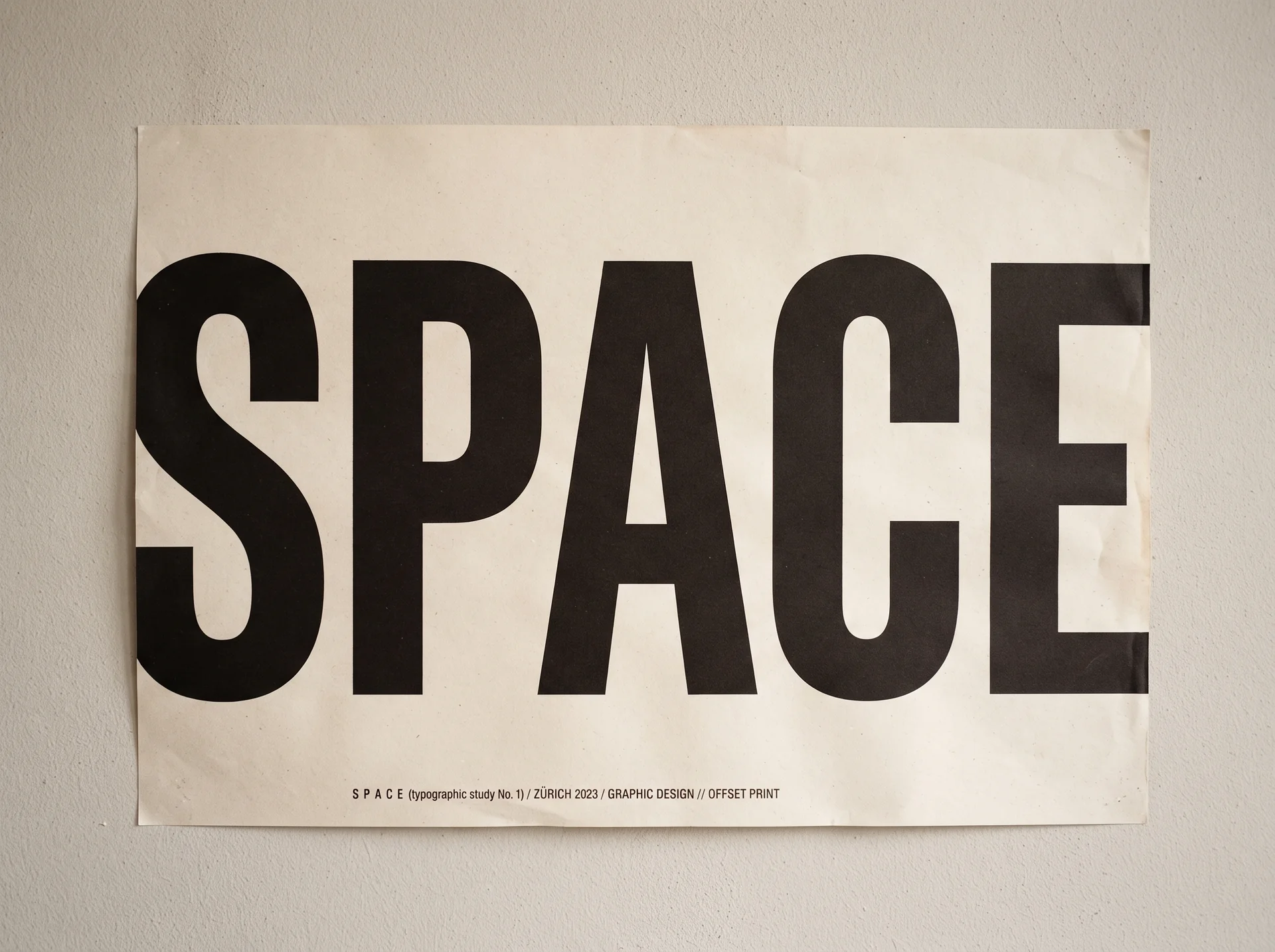
Garbled Text in AI Posters: Why It Happens and How to Get Clean, Readable Lettering
AI posters fail on lettering more than artwork. Why diffusion models garble text, which words render reliably, and the workflow that gets exact poster copy.
On this page
Ask an AI image model for a poster and the artwork usually arrives impressive: balanced composition, coherent lighting, a style that looks intentional. Then you zoom in on the headline and it reads "SUMMER SALSE" — or dissolves into glyphs that almost spell words. Garbled lettering is the most common reason AI posters fail in real use, and the cause is architectural, not bad luck. The fix is a workflow, not a lottery ticket. This article covers why AI-generated poster text comes out wrong, which words a poster generator renders reliably, how to prompt for exact copy, when to keep text out of the render entirely, and how to recover when the first draft spells your event wrong.
Why does text in AI posters come out garbled?
Because image models don't read — they imitate. When you ask a diffusion model to put words on a poster, it isn't processing language; it is pattern-matching the shapes letters tend to make in its training data. As UX Collective's analysis of AI text rendering explains, the model has seen millions of billboards and book covers but was never taught what those squiggles mean or how spelling rules work. That produces the fundamental mismatch: a face can be slightly asymmetric and still look human, but misspell one word and the whole poster looks broken.
The diffusion process makes it worse. During generation, fine details like individual letters are treated as low-priority in the early denoising steps, so errors get "baked in" before the model ever reaches the fine detail passes — and there is no feedback loop checking whether the guessed letterforms spell anything. The same analysis cites a 2025 benchmark study published in MDPI that found all major models, including DALL-E 3, Ideogram, and Stable Diffusion, face "significant challenges with text accuracy"; on code-related text, Stable Diffusion scored 1.25 out of 5 and Ideogram just 1.75.
Newer models are better, but headline claims outrun reality. Ideogram is reported to achieve roughly 95% accuracy on text prompts versus Midjourney's approximately 40%, yet when the UX Collective author stress-tested it with a bookshelf of real titles, results were still riddled with errors — "Don't Make Me Think" came out as "DON'T MAKE ME M THINK THINK". Single short strings fare well; heavy-text scenarios still fail.
Which words can an AI poster generator render reliably?
The reliable zone is small and well-defined: short, few, and prominent. One headline, a date, a venue line, a call to action — especially in all-caps, which removes the ascenders and descenders that give letter-guessing room to drift. Every additional word multiplies the chances that one letterform goes wrong, so long paragraphs, fine print, and multi-line lists are where posters fall apart.
Two categories deserve extra suspicion:
- Numbers and dates. "JUNE 15" and "JUNE 18" are equally plausible shapes to a model, so verify them first, every time.
- Names. Proper nouns — a band, a brand, a street — have no statistical anchor in the model's sense of "likely words", and are exactly where confident-looking misspellings appear.
This is also why a competent poster workflow asks for your exact strings instead of inventing copy: a model-proposed headline that reads beautifully but isn't your event title is still a failed poster.
How do you prompt for exact poster copy?
Prompt tutorials across tools converge on the same structure — design type, text content, placement, then visual style (an example of the formula) — and for posters the text part matters most. Four rules cover it:
- Quote every string verbatim, in quotation marks: the title, date, venue, and CTA. "Jazz Night" as a concept will render loosely; "JAZZ NIGHT" as a quoted string gives the model one target.
- Say where each string goes and how it reads: top third, heavy weight, high contrast against the background, two lines maximum. Placement and contrast instructions do real work.
- Add the negatives: no extra words, no duplicated text, no misspellings. Without them, models love to add plausible-looking filler lettering.
- Change one thing per revision. When a draft is nearly right, re-rolling the entire prompt discards what worked. Name the single defect — headline too small, wrong date weight — and fix only that.
Can you fix garbled text after a poster is generated?
Less reliably than you'd hope. Editing turns out to be harder than generating: when a model inpaints a garbled region, it must preserve everything around the text while repainting only that region, and research on latent-diffusion inpainting shows large or irregular regions tend to produce "blurry or contextually ambiguous reconstructions" — patched-looking letters that don't match the original type. UX Collective's write-up covers this gap in detail, including dedicated fix-it tools like Storia Lab's Textify and Canva's Grab Text, which work on simple corrections but shouldn't be trusted with complex multi-line text.
The better default is diagnose, then regenerate one variable at a time. Look at the failed poster and classify the defect:
- Wrong spelling → is the string quoted exactly, and is it short enough? Shorten or set it in caps.
- Right spelling, ugly placement → adjust placement, weight, or contrast instructions only.
- Lettering fights the artwork → reserve space (next section) or reduce in-image text.
- Everything wrong → the brief was overloaded; cut the word count.
Three targeted retries beat thirty blind re-rolls, both for quality and for the credits you burn getting there.
When should you keep text out of the AI render entirely?
When letter-perfect fidelity is non-negotiable — legal lines, long disclaimers, detailed schedules, brand lockups — the professional move is to stop asking the model to render them at all. Instead, ask for a copy-safe zone: a clean, quiet area of the composition reserved for type, then set the exact lettering yourself in Canva, Figma, or Photoshop. Generate-then-overlay is the established professional workflow precisely because real fonts guarantee what diffusion cannot: correct spelling, correct kerning, selectable and editable text (UX Collective documents the pattern as one of the main workarounds while models catch up).
The division of labor that works: the AI owns the image, the hierarchy, and the mood; you own any copy that must be letter-perfect. A poster that is 80% text was never an image-generation problem in the first place.
How does DeepKolor's AI poster generator handle text differently?
Most poster tools hand you one static render and wish you luck. DeepKolor's AI poster generator is built around the workflow above instead of a one-shot prompt box:
- You supply exact copy, and it gets quoted. The poster agent takes your title, date, and venue as literal strings, then sets each one's placement, weight, contrast, and line breaks — rather than improvising plausible-looking filler.
- In-image text stays short and all-caps, the form that renders most reliably, and when letter-perfect fidelity is critical the agent reserves a copy-safe zone instead of gambling on in-image typography.
- Every render gets inspected. After each generation the agent checks hierarchy, crop, contrast, and lettering, then retries with one diagnosed change at a time — the same one-variable loop described above, automated.
- Poster types follow real conventions. A movie one-sheet, a gig poster, an exhibition announcement, and a conference flyer each get their own hierarchy rules, not one generic template.
- Your photos survive. Upload a portrait, packaging shot, or logo and the agent switches to image-to-image so the subject stays intact while the composition is redesigned around it.
- Exports go up to 4K, so the finish holds on screens and in print workflows.
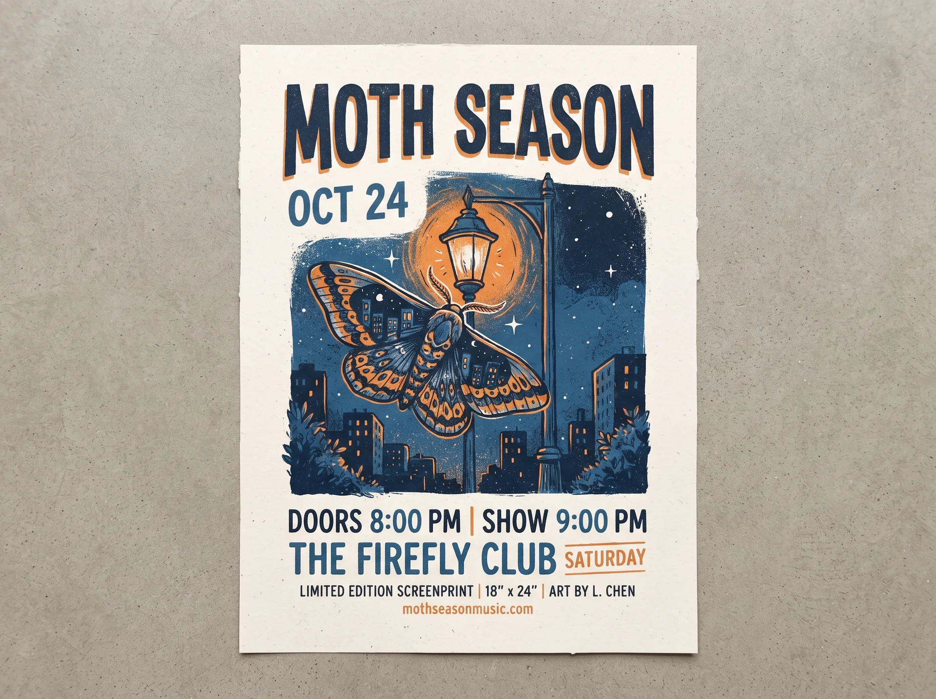
The conversational loop is the practical difference: you describe the poster in a sentence, get a first draft in seconds, then keep chatting — "make the headline larger", "mute the palette" — until the lettering reads right, instead of re-rolling a prompt box and hoping.
What can't AI poster text do yet?
Honesty section, because the limits are real:
- No guaranteed letter-perfect typography from any model. Whatever the tool, verify every word, number, and date at full zoom before a poster goes to print.
- Output is a raster image. No editable layers, no vector type, no print-bleed guarantees. If your printer needs bleed-safe PDFs with live text, that's a post-production step.
- Multi-line body copy still belongs in a design tool. Models render a short headline far better than a paragraph; the copy-safe zone exists for a reason.
- Agent-proposed copy is a suggestion. Where the AI proposes lettering you didn't supply, treat it as a draft to approve or replace, not as your copy.
Summary
- Garbled text is architectural: diffusion models imitate letter shapes without reading them, and errors bake in early (UX Collective).
- The reliable zone is short, few, and prominent — headlines, dates, venue lines, ideally in caps.
- Prompt with exact quoted strings, explicit placement, and negative instructions; change one thing per revision.
- Fix by diagnosing and regenerating one variable, not by inpainting or blind re-rolls.
- For letter-perfect copy, reserve a copy-safe zone and set real type in a design tool — or use a generator that automates the whole loop.
Sources
- UX Collective — Lost for words: why text in AI images still goes wrong — diffusion text failures, the MDPI 2025 benchmark, inpainting limits, and the generate-then-overlay workflow.
- GLM Image — AI poster design generator guide — the prompt formula (design type + text content + placement + style) observed across tutorials.
Frequently asked questions
Can an AI poster generator render exact text?
Short text, yes; long text, no. A quoted headline, a date, or a venue line in caps renders reliably, while paragraphs and fine print are where models fail. For copy that must be letter-perfect, use a copy-safe zone: have the generator reserve clean space and set the exact strings in a design tool afterwards.
Why does AI-generated poster text come out misspelled?
Diffusion models don't read — they reproduce the shapes of letters seen in training data. Individual letters are low-priority during early denoising steps, so errors are baked in before fine details form, and the model has no built-in check that its letterforms spell anything (UX Collective).
How do I get readable text on an AI poster?
Quote each exact string in quotation marks, keep in-image copy short and in caps, state where each string sits and how heavy it should be, add "no extra words, no misspellings" to the prompt, and fix problems by changing one variable per revision rather than re-rolling the whole prompt.
Is it better to add text in Canva or Photoshop afterwards?
For long or business-critical copy, yes. Generating the artwork text-free and overlaying real typography is the established professional workflow — it guarantees spelling, kerning, and editability that in-image AI text can't. Short headlines and dates are fine to render in-image.
What resolution should an AI poster be exported at?
Export at the highest resolution available — DeepKolor supports up to 4K — so the design holds on large screens and in print workflows. Whatever the resolution, check the lettering at full zoom before sending anything to a printer; resolution doesn't fix a misspelled word.
Do I need design skills to get clean text on an AI poster?
No. With a conversational generator like DeepKolor's AI poster tool, you describe the poster, supply the exact copy, and request changes in plain language — the agent handles hierarchy, placement, and the diagnose-and-retry loop. The overlay workflow in Canva or Figma is only needed when copy must be letter-perfect and long.
Related posts
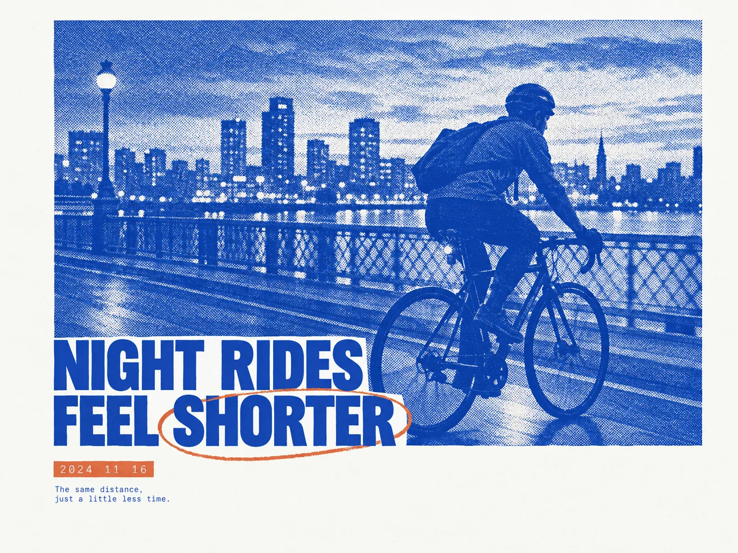
How to Make a Risograph-Style Poster Without a Printer
The riso look comes from paper, two inks, halftone plates, and whitespace acting as one system. What risograph posters are, why they are trending in 2026, and how DeepKolor's mono-print-poster skill generates one from a single prompt.
What Is an AI Design Agent? Definition and How It Works
An AI design agent takes a brief, creates the visual, and edits with you in chat. See how it differs from image generators and when to use one.
AI Jewelry Product Photography: How to Create Ecommerce Images That Sell
Learn how to create AI jewelry product photography for rings, necklaces, and bracelets — from one clean source photo to ecommerce-ready images, plus accuracy limits and marketplace image rules.