How to Make a Risograph-Style Poster Without a Printer
The riso look comes from paper, two inks, halftone plates, and whitespace acting as one system. What risograph posters are, why they are trending in 2026, and how DeepKolor's mono-print-poster skill generates one from a single prompt.
On this page
A risograph-style poster used to require one of two things: a riso duplicator, or an afternoon in Photoshop separating artwork into ink layers by hand. DeepKolor's mono-print-poster skill replaces both with a conversation. You hand it a theme, a phrase, or a photo, and it returns a poster assembled the way real print is assembled — neutral paper, at most two inks, halftone-dot imagery, and empty space used as structure. This article covers what actually produces the riso look, why one- and two-ink posters are everywhere in 2026, how the skill encodes the print system into a recipe, and when to use something else.
What is a risograph poster, and why does it look printed rather than filtered?
A risograph is a high-speed digital duplicator that Japanese company RISO Kagaku has built since the mid-1980s — essentially a photocopier crossed with screen printing Riso Pop. The machine burns a master stencil, pushes soy-based ink through it onto uncoated paper, and prints one ink per pass, one drum per color, which is why multi-color riso work carries the slight misregistration the format is known for University of Illinois School of Art & Design. Riso can only print on uncoated paper, so the paper texture is part of every print Outlet PDX.
Halftone is the second pillar. A photograph holds far more tonal information than two inks can carry, so the image is converted into a grid of dots — larger dots for darker areas. Risograph machines offer both dither-like grain stencils and structured halftone dots, and which one you get changes the texture of the whole print Risotto Studio.
That combination — one or two spot inks, mechanically reproduced dots, visible paper — is why a color filter over a digital photo doesn't read as riso. A filter recolors existing pixels; the riso look replaces pixels with a plate structure sitting on paper.
Why are one- and two-ink print posters trending in 2026?
Design trend write-ups call the current wave "neo-print": halftone textures, distressed surfaces, and deliberately imperfect print cues pushing back against hyper-polished AI imagery Artcoast Design. When anyone can generate a clean gradient-heavy image in seconds, the visible marks of a press become the scarce thing.
The clearest open-source signal is mono-color-skill, a one-ink editorial print skill for Claude Code by designer Yan Liu. It reached roughly 3,200 GitHub stars by September 2026 the mono-color-skill repository, and a widely shared WeChat article introduced it to Chinese readers as a way to get magazine-grade visuals from a single sentence 别再手动做封面图了 — WeChat.
The aesthetic also stays in circulation because riso printing is cheap at short runs — zines, gig posters, poetry chapbooks — which keeps fresh printed reference material in front of designers Carolyn Yoo.
Can you fake a risograph look without a printer?
Yes, and illustrators have documented the workflow: separate the artwork into one layer per ink, set the layers to multiply so overlapping inks overprint like real ink, then add grain and misregistration masks to imitate the machine's imperfections Liz Nugent. Riso inks are spot colors rather than CMYK builds, so the separations are manual work — there is no one-click conversion.
The cost is time and consistency. One poster takes hours of layer work, and a series — three posters for one event, twelve covers for a zine — repeats that discipline by hand each time. That repeatable-consistency problem is exactly what a rule-driven skill can take over.
How does the mono-print-poster skill turn a prompt into a print recipe?
DeepKolor ships the same discipline as an official skill in its skill library, under the poster category. Instead of styling a finished image after the fact, the skill fixes the print system as a catalog and resolves your brief against it before generating:
- Substrates — neutral white
#FAFAF7by default, cool gray or pale beige when the subject warrants. The paper never yellows unless you ask for vintage. - Inks — a fixed palette; the default pairing is cobalt
#2148B8with terracotta#C65F38. Four print modes: pure one-ink, chromatic plus black, complementary duotone, overprint duotone. - Plate roles — the dominant ink carries 70–85% of the printed area; the accent ink gets 15–30% and one named job, such as a date strip or a circled word.
- Structure — 25–55% of the canvas stays visibly empty paper, margins run 5–9% of the page width, and the layout declares exactly one focal event plus one deliberately quiet region.
- Type — at most three voices: one display, one functional support, optionally one short handwritten interjection. Text you supply prints verbatim — wording, language, and line breaks.
- Imperfections — zero to two controlled effects for contemporary work, two or three when you request a tactile or vintage mood.
Resolution is deterministic: the same brief resolves to the same substrate, inks, and layout family, so retries and a matching poster series hold together instead of drifting. Supply a photo and the skill switches to image-to-image: it keeps the subject and re-renders it as ink plates, and it does not swap your subject for a lookalike.
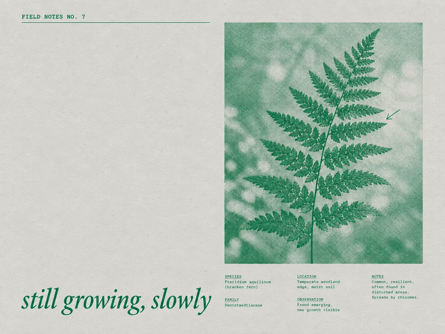
The journal page above is the one-ink mode: botanical green on pale beige, a specimen layout with a data strip, italic display line, and most of the page left as empty paper.
What do the results look like?
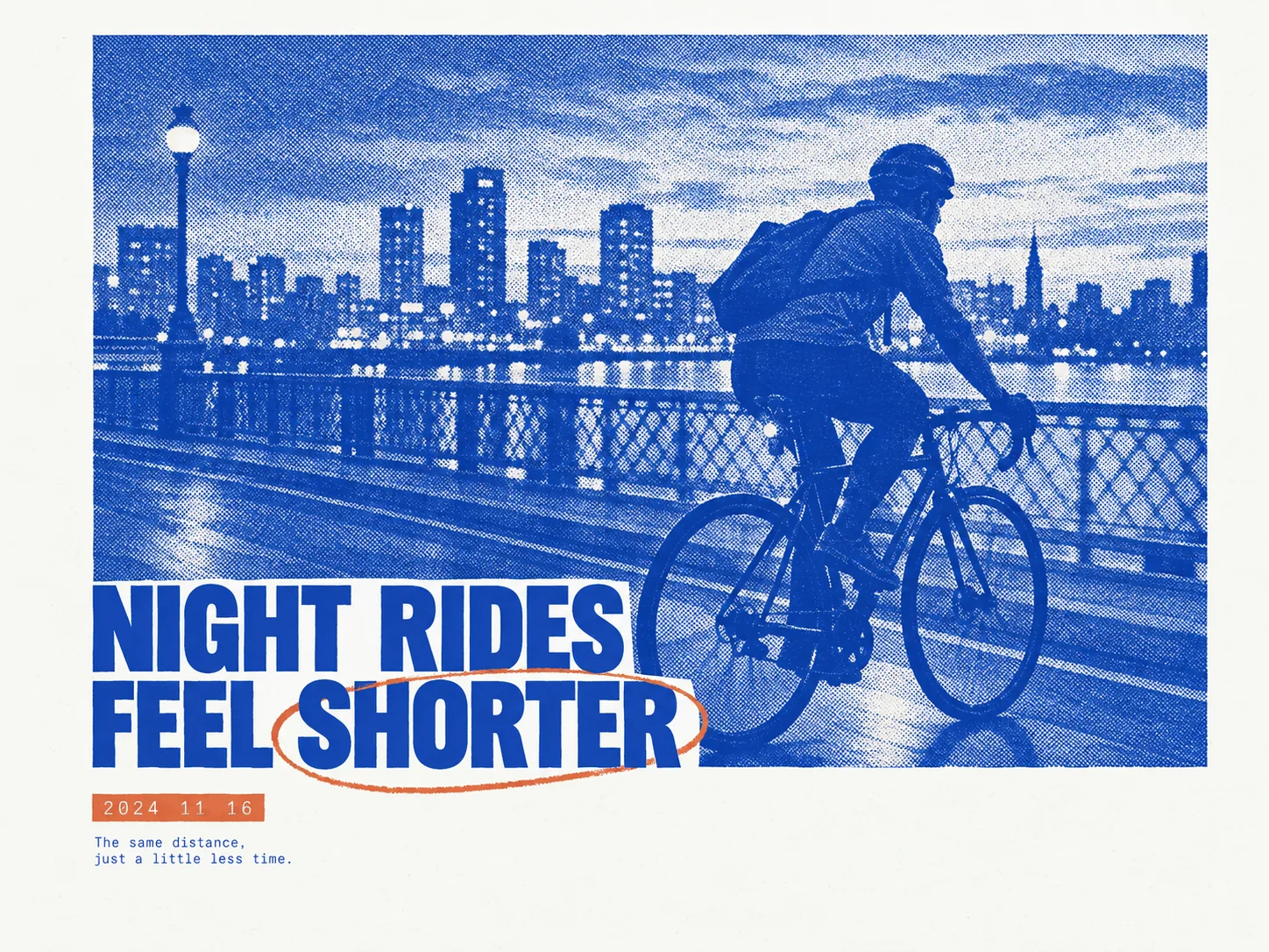
The blue poster at the top of this article is the default two-ink recipe at work: a cobalt halftone photograph of a night ride, a terracotta accent circling one word of the headline, a small date strip, and a one-line caption. One image zone, one typographic event, the rest bare paper.
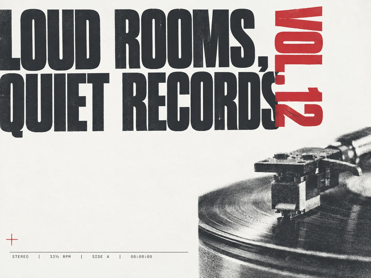
The zine cover above pushes the type role instead: the charcoal headline is oversized until it becomes the focal event, a signal-red volume marker rides the right edge, and the halftone turntable photo occupies the lower right. Same system, different layout family — a matched set shares ink and spacing logic, not the same layout.
How do you make a two-ink print poster in DeepKolor?
- Open a chat in DeepKolor and install or select the mono-print-poster skill. Describing a one- or two-ink print poster in plain language is usually enough for the agent to route there on its own.
- State the brief: a theme, a phrase you want printed, an article idea, or a photo. Add optional constraints — exact text, a ratio (3:4 by default; 1:1, 4:3, 9:16, and 16:9 also work), one ink or two, contemporary or vintage mood.
- Generate. The skill resolves the recipe and returns one poster, and the reply lists the layout family, the inks with hex values, and the exact strings it printed.
- Iterate in chat — ask for a one-ink variant, a different layout family, or coarser screening — then download the result.
The back-and-forth is the broader DeepKolor poster workflow: the AI poster generator page covers conversational editing of copy, layout, and style across rounds for every poster type. For why supplied lettering usually survives generation in this workflow, see our piece on garbled text in AI posters.
Risograph-style, duotone, or full-color AI poster: which one fits the brief?
Full color wins when the poster's job is realism or recognition — product promotions, event photography, anything that needs a broad palette. Use the general poster workflow for those.
Two-ink duotone suits photo-led editorial: a portrait or a place re-rendered as plates keeps more tonal depth than one ink allows, with a unified palette for free.
One ink is the most restrained and the hardest to fake well — everything hangs on typography, spacing, and the contrast of a single color. Covers, poetry, announcements.
Riso-style with two inks owns the zine-and-gig territory: culture posters, music nights, journal covers, anything that should feel printed rather than streamed.
The format has hard edges. Brand work that must reproduce a multi-color palette exactly won't fit under a two-ink ceiling. And if the destination is an actual riso press, treat the output as the concept — the studio prepares its own separations for its drums.
What are the skill's limits?
- The output is a print-style raster concept, not press-ready CMYK. For a commercial print run, overlay final micro-text — URLs, prices, legal lines — in a layout tool and hand the file to a print shop.
- Two inks is a hard ceiling; the skill refuses a third (overprint overlap doesn't count as one).
- Contemporary is the default mood; yellowed paper and distress props appear only on request.
- The imperfections emulate a press rather than replace one — real riso misregistration follows the physical drum, not a recipe.
Summary
The riso look is a system — substrate, inks, plates, whitespace — and systems can be encoded into a recipe, which is what mono-print-poster does. To judge it quickly, brief it the way a designer would: subject, intent, one short phrase, two inks, then repeat the same brief and check that the second render resolves to the same inks and layout. It will — the recipe is deterministic even when the pixels vary.
Sources
- Riso Pop — What is Riso?
- University of Illinois School of Art & Design — Risograph printing for zines and comics
- Outlet PDX — riso FAQs
- Risotto Studio — risograph tutorials
- Artcoast Design — Graphic design trends 2026: halftone and neo-print
- yanliudesign/mono-color-skill on GitHub
- 别再手动做封面图了!这个 2.2k Star 的神级 Skill,一句话生成杂志级视觉 — WeChat
- Carolyn Yoo — How to print a risograph zine
- Liz Nugent — How to fake a riso print
Frequently asked questions
Is risograph printing the same as screen printing?
No. Screen printing pushes ink through a mesh by hand; a risograph is an automated stencil duplicator that combines screen-printing aesthetics with copier speed University of Illinois School of Art & Design.
What does duotone mean in printing?
A duotone reproduces an image with exactly two inks — usually black plus one spot color — trading the full spectrum for tonal depth and a built-in color scheme. In the mono-print-poster skill, duotone is one of four print modes, alongside pure one-ink, chromatic plus black, and overprint duotone.
Can AI produce a real risograph print file?
Not this skill. It returns a print-style raster image, not press-ready separations. Riso studios print from separations prepared for their specific drums, so use the output as the approved concept and let the studio build the press files.
Do I need design experience to use the skill?
No. Substrate, inks, layout family, and type roles resolve from your subject by default. You can override any of it — named inks beat catalog defaults, and an explicit ratio or mood carries through.
Can I use my own photo?
Yes. The skill keeps the subject's identity and converts the image into ink plates via image-to-image. It can crop, isolate, enlarge, or abstract the photo, but it does not replace the subject or invent branded details.
How much empty space does this poster style need?
By rule, 25–55% of the canvas stays visibly empty paper, the main image or object zone occupies 45–80% of the page, and margins run 5–9% of the page width. The whitespace is a layout decision, not leftover canvas.
Related posts
Garbled Text in AI Posters: Why It Happens and How to Get Clean, Readable Lettering
AI posters fail on lettering more than artwork. Why diffusion models garble text, which words render reliably, and the workflow that gets exact poster copy.
What Is an AI Design Agent? Definition and How It Works
An AI design agent takes a brief, creates the visual, and edits with you in chat. See how it differs from image generators and when to use one.
AI Jewelry Product Photography: How to Create Ecommerce Images That Sell
Learn how to create AI jewelry product photography for rings, necklaces, and bracelets — from one clean source photo to ecommerce-ready images, plus accuracy limits and marketplace image rules.